Choosing to live in one apartment versus another has become more about personal taste, style, and aesthetics than ever before.
Some residents choose to live in a home that reflects their love of adventure and the outdoors, while others choose an upscale apartment that reflects their passion for socializing in the city. Tapping into these deeper desires and tastes of your potential audience is what logo design can do for your business – and at Brindle, that’s what we’re all about.
Let’s look at these apartment logo design ideas that did it right by capturing their vision, aesthetics, and values through their designs. Plus, we get to show off some of the incredible brands we’ve created at Brindle – so we’d say it’s a bit of a win-win situation.
The Alpine – Apartment Logo Design (designed by Brindle)
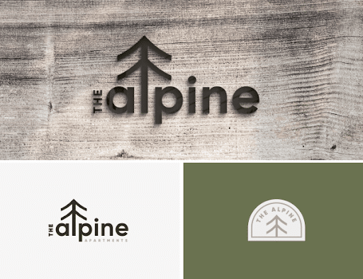
The Alpine Apartments located in Fort Collins, Colorado was looking for a naturalistic logo that would stand out from the competitors while capturing their drive to be youthful, outdoor-focused, and fresh. We created a modern apartment logo design with deep green colors, nature illustrations, and an organic typeface.
The uniqueness of this logo design is the letter ‘l’ of Alpine illustrated on a tree, the name Alpine is still simple to make out. The lowercase letters of ‘Alpine’ also capture a sense of approachability, youthfulness, and clarity that contrasts heavily with the competitors in their space. At Brindle, we’ll make sure your logo design doesn’t just capture your vision but stands out amidst the crowd.
The Upland Apartments logo (designed by Brindle)
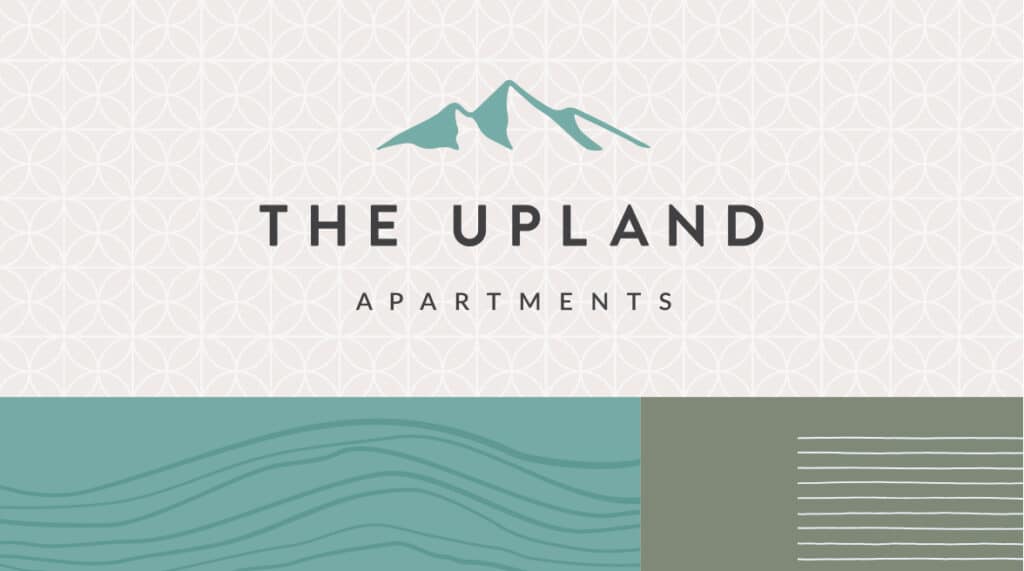
The Upland Apartments located in Boise, Idaho is a multifamily apartment community that wanted to bring a sense of vibrant lifestyle, community, and energy to its logo while capturing the surrounding landscape. With inviting teal colors, organic patterns, and contrasting dark tones, this logo and brand identity captured their vision.
The Upland’s logo itself mixes an organic illustration with a simple, approachable typeface that reflects its mission to bring community and energy amidst a beautiful environment. Sounding like a great place to live? We think so, too.
The Flats Fort Collins logoS (Designed by Brindle)
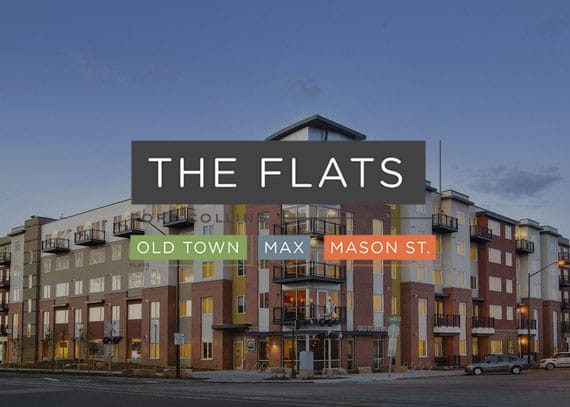
The Flats Fort Collins is a vibrant downtown apartment community with three distinct apartment communities just blocks apart from each other in Fort Collins.
The challenge? These three locations were close in proximity to one another, however, no one was aware they were related apartment communities. We created a parent brand for the overarching community, The Flats, and three child brands for each of the apartment locations, capturing their uniqueness but creating a clear connection between the different buildings.
The bold lines and sans-serif font chosen for these logo designs capture the simplicity of the city while bringing in organic, vibrant colors from the beautiful surrounding landscape in Fort Collins, Colorado. This brand is known to be upscale, fresh, and community-focused in the Fort Collins area, reflecting not only its logo but its brand itself. The similar design between each apartment location also helps bring brand consistency and unity to the Flats Fort Collins.
202 Park (Designed by Brindle)
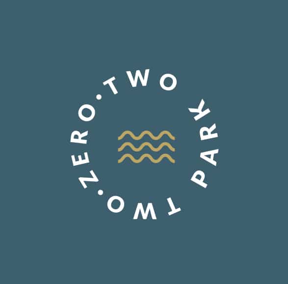
This modern apartment logo design for 202 Park Apartments was created with circular arcs, forms, and wave elements as a testament to 202 Park’s waterfront apartments in Cherry Hill, New Jersey. With modern amenities, pet-friendly accommodations, and a short walk to the beach, this apartment community’s taste for high-class with a touch of adventure is reflected through this modern, upscale logo design.
The Apartments at Maddie logo design (Designed by Brindle)
These new apartments in downtown Greeley, Colorado is another family of apartments with an overarching brand, ‘The Apartments at Maddie’ with three distinct locations. The goal was to create a brand that not only appealed to a younger generation but had a nod back to Greeley and Weld County’s history. We did this in several ways with a custom typeface, distinct typography for the parent logo, and custom icons for each apartment location that tie back to Weld’s agricultural roots.
…
We enjoyed reviewing those logo designs and hope they provided ideas for your apartment logo design. There’s nothing like fresh inspiration to spin the creative wheel!
Businesses everywhere invest in logo design to help them stand out from competitors and translate their mission to their audience. In a crowded space, it can be tough to know how to attract your audience’s attention and what steps need to be taken to capture your brand perfectly.
At Brindle, we’ll make sure to ask you all the right questions to dig deep into what will match your brand, personality, and mission to a “T”. Plus, we’ll show you several different logo options so you can give your feedback and ensure your vision is captured.
Contact us to book an intro call, no pressure. We’d love to chat! If you’re looking for more logo design inspiration in the meantime, check out our portfolio page or view our apartment logo design offerings.
– Kalli