When Gateway Place Apartments in Greeley, Colorado, came to us, they were facing a challenge. Their newly built phase two had launched during the pandemic, and they needed a way to differentiate between the two phases while driving more online leasing activity.
Their current apartment website wasn’t capturing the attention they needed, and they wanted a solution that could effectively highlight the property’s offerings and convert visitors into leads.
They were also looking for strategies on how to increase time spent on the website to keep visitors engaged longer and improve conversion rates.
How to Increase Time Spent on Your Website: Want Visitors to Stick Around Longer?
If we had to guess, you’re here because you want people to spend more time on your website too, right? Well, you’re in the right place. The key to increasing time spent on your site is creating an engaging experience that keeps visitors coming back for more.
Keep reading to find out how we helped Gateway Place boost engagement and how you can apply these strategies to your own site.
What did we do?
We implemented the Conversion-Driven Design Framework to transform Gateway Place Apartments’ multifamily website design.
This approach led to a remarkable 76% increase in the average time users spent on the site and 20 leases signed in just one month. But the success didn’t stop there.
When we compared the pre-website redesign stats to the post-launch results, the impact was even more significant.
The Problem: A 2010 Website in a Post-Pandemic World
Before we stepped in, Gateway Place Apartments was dealing with a common issue in the multifamily industry: their apartment website didn’t reflect the modern, vibrant community the property had become.
Phase two was an exciting development, but the old website was stuck in the past — literally in the 2010s. It was outdated, did not provide users any information on pricing, virtual tours, or how to schedule a tour which led to poor engagement.
At that time, the website was receiving an average of 132 organic visits per month, but the pandemic had shifted how renters interacted with real estate online. Digital experiences were no longer a nice-to-have — they were a necessity.
This is where our focus on how to increase time spent on the website became a game-changer…
The Solution: The Conversion-Driven Design Framework
We saw a golden opportunity to revamp Gateway Place Apartments’ digital presence into a high-converting leasing tool. By applying our Conversion-Driven Design Framework which combines dynamic design and user-centric content, we didn’t just create a visually appealing site but also crafted an engaging experience for users that turned visits into leases.
This apartment marketing strategy elevated the property’s online presence and ensured that every visitor had a seamless, compelling journey.
Here’s how we applied the Conversion-Driven Design Framework:
Dynamic Design: An Apartment Website That Responds to User Needs
In the multifamily world, mobile-first design isn’t just a nice-to-have — it’s a must. Our recent apartment market survey revealed that 75% of renters rank a website’s ease of navigation as one of the most important factors when searching for an apartment.
It’s simple: if renters can’t find what they’re looking for quickly, they’ll move on.
That insight shaped our approach to Gateway Place Apartments’ website redesign. We didn’t just make it look better — we made sure it worked better, too.
Here’s What We Did:
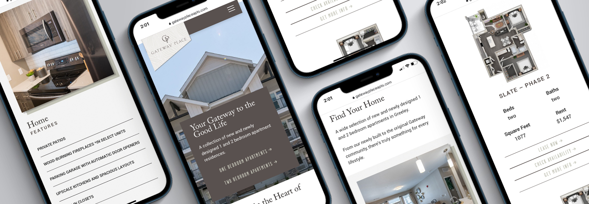
Responsive Design That Works Everywhere: We built a site that adapts perfectly to any device — mobile, tablet, or desktop. And we didn’t stop there. Since our apartment survey revealed 83% of renters are more likely to stick around if floor plans and units are easy to find, we made sure the layout made sense. No more endless scrolling or hunting for information.
Modern Visuals That Tell a Story: The old website? It looked like a time capsule from the ’90s — lifeless colors, generic stock photos, and zero personality. We gave it a complete makeover with modern, story-driven visuals that highlight what makes the property stand out:
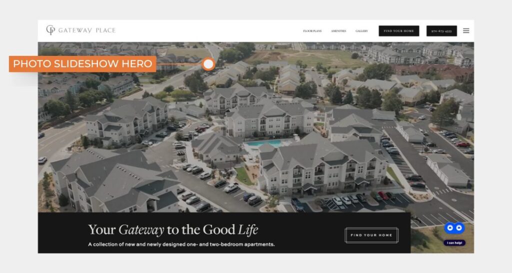
- Photo Slideshow Hero: Showcases the property’s best features with custom photography to make a strong first impression.

- Bold, Large CTA Buttons: Easy-to-spot buttons guide renters to key actions like booking a tour or viewing floor plans.
- Unique Gallery Callout Section: Combines property images with brand colors for a cohesive, personalized feel.
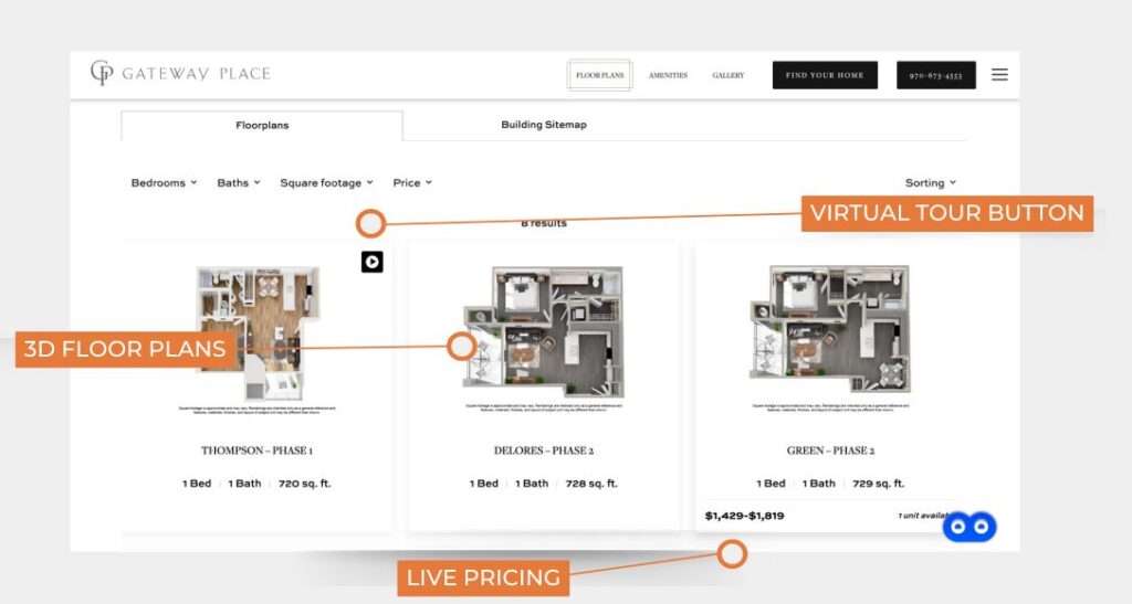
- Floor Plans with 3D Renderings & Real-Time Pricing: Provides renters with the details they want right away, no digging required.

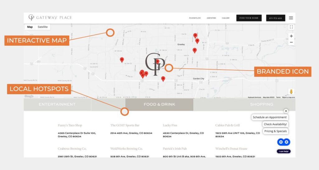
- Interactive Map Section: Pinpoints the property’s location and nearby hotspots with a branded icon.

- “Book A Tour” Section Above the Footer: Serves as a friendly reminder to schedule a visit.
Speed That Keeps Renters Around: With our recent research showing that 85% of renters are more likely to leave a site if photos and information are difficult to find, we prioritized a fast-loading, streamlined experience. By implementing caching, compressing images, and optimizing code, we ensured the website loaded quickly and kept users engaged.
It wasn’t just about making the website look good. It was about creating an experience that helped renters find their future home.
User-Centric Content: Giving Visitors What They Need, When They Need It
A beautiful apartment website is only effective if the content is clear, relevant, and valuable. We crafted compelling, SEO-optimized content that answered prospective renters’ questions and guided them through the decision-making process.
What we did:
- SEO-Optimized Copy: We researched the top search terms for renters in Greeley, such as “apartments in Greeley” and “pet-friendly apartments in Greeley.” By embedding these keywords across the site, we boosted organic traffic and answered potential residents’ questions.
- Neighborhood Guides: Showing off the community was key. We created detailed guides about the Greeley area, covering schools, parks, dining, and shopping. This allowed prospective renters to envision their lifestyle in the neighborhood.
- Clear Calls to Action (CTAs): We placed strategically positioned CTAs like “Schedule a Tour” and “Apply Now” throughout the site to drive conversions. These clear action prompts directed users deeper into the leasing process, boosting engagement.
The Results: 76% Increase in Website Time and 20 Leases in 2 Months
Within a year of launching the new apartment website, Gateway Place Apartments saw dramatic improvements. Organic traffic surged from 132 visits per month to 1,330, a massive 900% increase. But it wasn’t just about traffic — it was about how visitors engaged with the site.
In 2024, the website was upgraded again using a sleek apartment website template, which boosted monthly traffic to 2,775 visits — an additional 108% growth. But the most exciting results were the direct conversions:
- 76% Increase in Time on Site: Visitors stayed longer, exploring listings, checking out the neighborhood, and applying for leases.
- 20 Leases Signed in One Month: The revamped website directly contributed to 20 new leases in just one month — a true testament to the power of unique, well-optimized apartment website design.
But That’s Not All: Combining Google Ads and Reputation Management
While the website played a major role in these results, we also incorporated additional strategies to amplify the impact.
What we did:
- Google Ads Campaign: We ran a targeted campaign on Google Ads for apartments focusing on specific keywords like “1 bedroom apartments in Greeley” and “Greeley pet friendly apartment,” bringing in even more qualified traffic and enhancing the website’s performance.
- Reputation Management: We helped Gateway Place improve its online reputation by encouraging happy residents to leave positive reviews, which boosted their overall rating and helped build trust with potential renters.
Let’s Chat About Your Apartment Website
At Brindle, we coined the Conversion-Driven Design Framework to transform websites into powerful, high-converting leasing tools. For Gateway Place Apartments, this approach didn’t just help them stand out from the competition; it converted website visitors into long-term residents.
By combining dynamic design, user-centric content, and strategic apartment marketing, we delivered results that speak for themselves. Part of the strategy involved how to increase time spent on the website, ensuring that visitors were engaged longer, leading to higher conversion rates.
Ready to elevate your apartment website? Let’s talk about how Conversion-Driven Design Framework can work for you.
