In this post, we’re sharing our secret sauce for landing page success. In fact, these changes resulted in a 28+% increase in conversion rates.
Ready to make some improvements to your splash or landing pages? Let’s dive into the 7 components to improve your apartment landing page – or any industry’s PPC landing page for that matter…
1 – Use Clear, Concise Copy that Converts
Confuse and you’ll lose.
Keep it simple, not cute.
Explain what you do, in Lehman’s terms.
Catching on?
As Donald Miller would say, “A caveman should be able to glance at it and immediately grunt back what you offer.”
Let’s check out a quick copywriting formula, adapted from Harry at Marketing Examples:
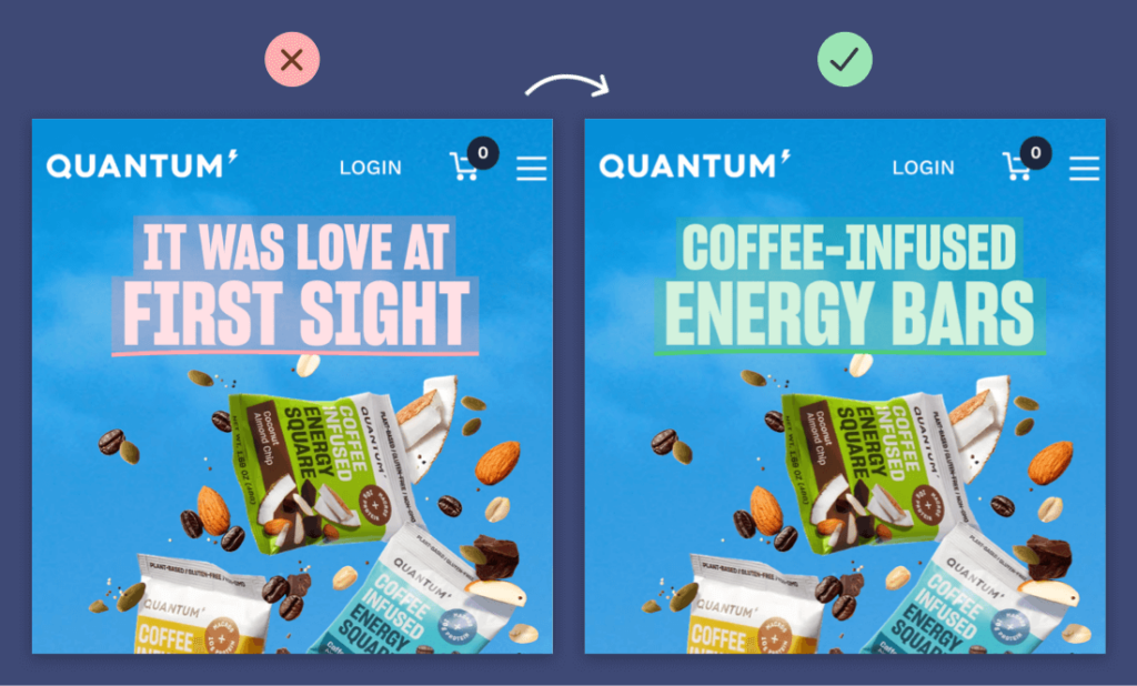
Step 1 – Write down the value you provide
Ex: Find Your New Apartment in Denver ….
Step 2 – Add a hook (your customer’s biggest objection)
Example Objection: wants to live close to the city but enjoy the peace and quiet of a community.
Hook Example: Quiet community & convenient location, finally in reach.
Put them together…
Quiet community & convenient location, finally in reach.
Find Your New Apartment in Denver Today at [apartment name]
Step 3 – Delete any unnecessary words
Final:
Quiet community & convenient location, finally in reach.
Find Your New Apartment in Denver Today at [apartment name]
Next, tell people what you want them to do, this is your primary CTA.
Examples of CTAs:
Schedule a tour now
Join our waitlist
Find your ideal move-in date
Check availability
Get Leasing Specials
2 – Multi-Step Forms
Multi-step forms on landing pages have been a total game changer for our apartment PPC ads.
Why? Well, we have a few ideas paired with real results from what the data tells us.
“People are terrified of forms. It’s time to give your visitors something different.” – Johnathan Dane
But let’s take a step back. What is a multi-step lead form?
Put simply, it’s a form that doesn’t ask for personal contact information upfront and instead aligns to the user’s search term or what you have to offer. The result: this lessens the threat and still doesn’t take any effort to fill out.
It allows the user to micro commit before they provide any personal information by splitting up the questions and having the visitor go to the next step, only seeing one question at a time.
Important: give people a solid reason on why (on the last step) they should enter their email and phone number.
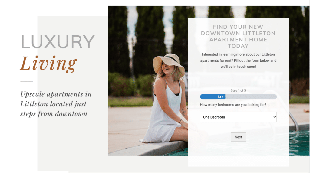
The 3-step formula for multi-step landing page questions:
1 – The first step or question is no threat to the user and aligns with their search
2 – next step is more mediocre
3 – And the last step is highest threat, or where you ask for the visitors’ contact info
If we were to ask all these questions in one setting, you would not get as high of a conversion rate (or at least we didn’t).
Please note: there may be varying opinions at play here from marketing pros who may challenge this, but we’re focused on generating quality leads over sheer volume. If you get 100 leads, 20 of which respond or 60 leads, 40 of which respond, the answer is simple on which you’d prefer.
3 – Avoid Overwhelm
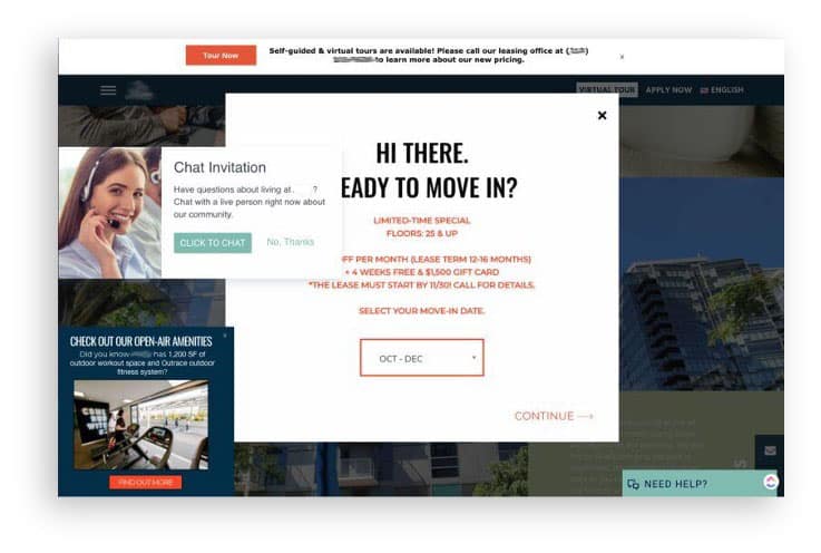
As tempting as it may be, keep your call to action simple – avoid multiple pop-ups, slide-in messages, and chat bots.
For example, if you were to land on this website… what would you do?
Leave? Hit the back button as fast as possible? Same.
4 – Show the pricing upfront
There’s a fine line between giving too much upfront and saving some for the sales call. However – and we realize we may be going against the grain here with some heavy hitters in the industry but hear us out – we’re past the internet marketing and sales era where being tightfisted with key decision-making information (ahem, pricing, pet policies, scheduling an online tour, etc.) helps you sell.
Prospects will move on if they can’t quickly qualify (or disqualify) your apartment as a place to consider. Prospects want information (like, now), and if they don’t find it with you, they’ll move on.
5 – Thank you page optimization
Don’t stop selling on the landing page. Include a reason on the thank you page, after the visitor has converted, to pick up the phone and give them an offer, or strong call to action to get in touch now. Use this as prime space to continue to nurture this lead.
6 – Make small, calculated changes to test performance
Two different re-designs going against each other, but make sure you make smaller changes, learn from them and you’ll know what.
If you’re ready to overall your landing pages. Hang tight just a sec. If you make a ton of edits all at once, you won’t know what changes drove or contributed to performance improvements.
We recommend making a change (i.e. implement a multi-step form on your landing page), then give it some time to perform and evaluate its performance after you have a good amount of data to work with to determine if the change was positive, negative, or neutral.
7 – Dynamic Text on Landing Pages

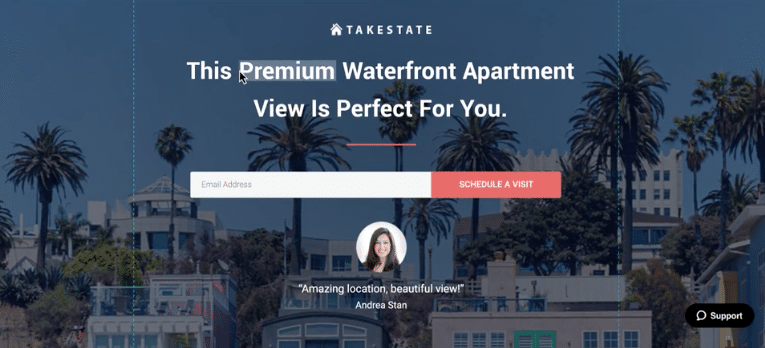
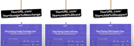
Dynamic text replacement on your landing page allows you to tailor content to match keyword search terms.
The result?
- Better post-ad experience by matching copy to your visitor’s search.
- Tailor the text to be more specific to the visitor’s search
- Improve performance
We use WordPress for landing pages and there are a few ways you can add dynamic text on WordPress.
A couple options:
– You can add shortcode with before and after parameters and get information from the request
– You can also do text replacement with JavaScript where you look for a div of a particular type.
– Or there’s always a plugin that’ll handle the heavy-lifting for you:
Hopefully you found these 7 action items to improve your apartment landing page helpful. Do you have anything to add that you’ve found creating a lift in performance? Share them below!
