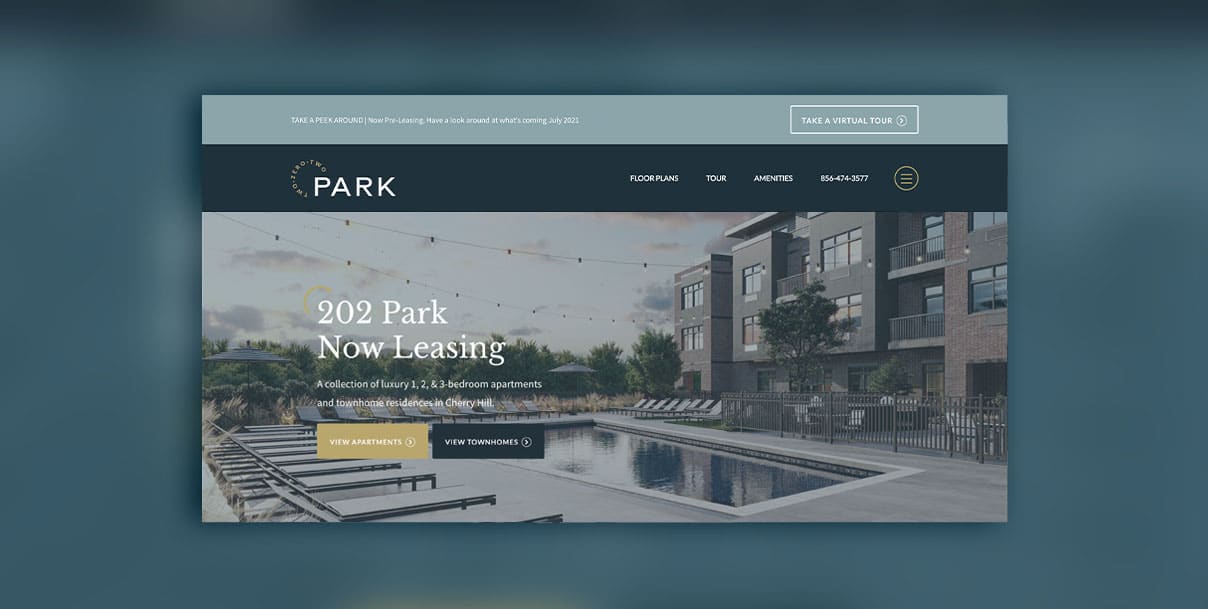
We’ll just say it: if your website looks bad, prospects are less likely to choose your community as a place to call home. To all the multifamily marketers and apartment leasing professionals, consider yourself warned.
There are several assumptions that get made when your website looks bad, including, “outdated website = outdated apartments”. Or a prospect may start to think, “Maybe they don’t keep up on other things such as maintenance, upkeep clearly isn’t valued”, and worse…if the visitor can’t find what they’re looking for, they’ll simply move on.
And while a great web design is important, user experience and overall functionality are equally (if not more) important.
What we look for in a good apartment website design:
- Being able to easily get to the information you’re looking for – hello, interior photos, video tours, and PRICING.
- Keeping your design simple vs over the top.
- Be clear, not cute (okay, okay, sometimes we try to accomplish both).
- Avoiding overwhelm; if a visitor is bombarded by pop-ups, chat prompts, and more, chances are high that they’ll leave (and often these features negatively impact your overall site performance).
Okay, let’s dive into a handful of sites that lend some serious apartment website inspiration and design ideas:
1. Gateway Place Apartments – built by Brindle
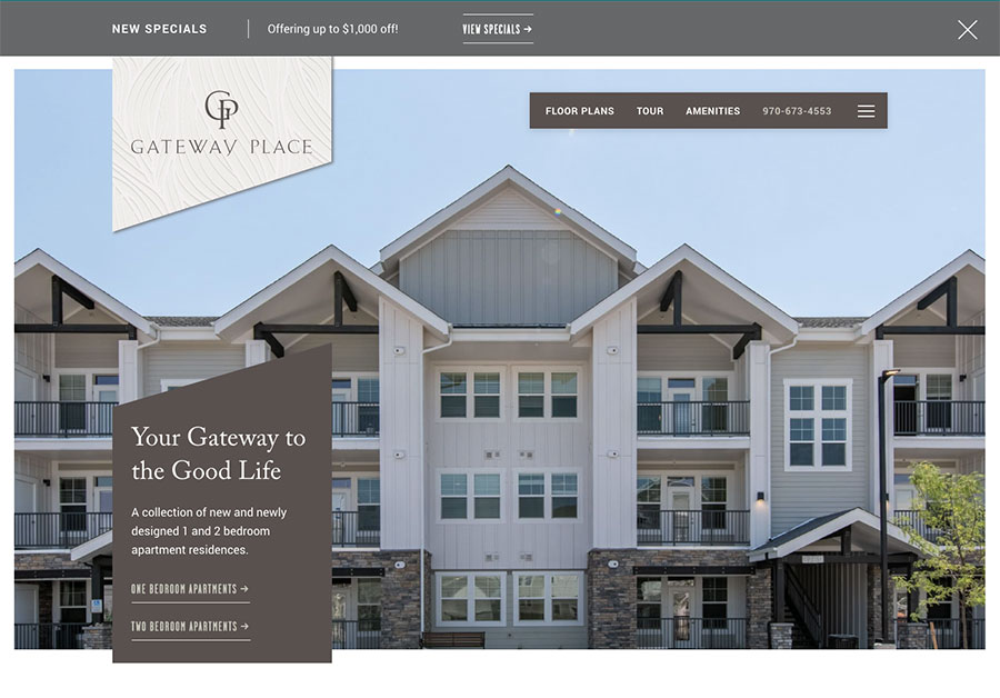
A luxury apartment community in northern Colorado, Gateway Place Apartments wanted an enhanced online presence to match their renovated units and brand-new phase two.
What it does well:
- Clear calls to action
- Simple navigation across the top menu with a hamburger menu for secondary pages
- Plenty of white space
- Easy to access live pricing and availability and complete the leasing process online
- Great virtual tours of the common spaces and units
Areas of improvement:
- A property sitemap would help visitors visualize the different phases that exist at this community
2. Havana Square Tampa
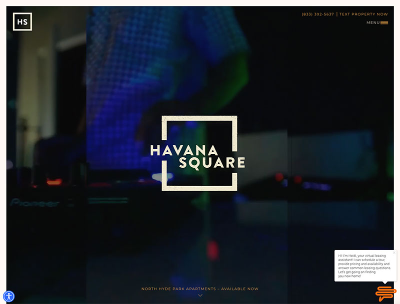
What it does well:
- Dynamic video to capture attention on the homepage
- Fun twist and unique design (you won’t see every other website looking similar to this one!)
Areas of improvement:
- Pop-up on immediate load of websites can cause negative impacts to SEO
- Lacking a prominent call to action above the fold
- Button contrast could be hard to read for some
- Live pricing and availability don’t appear on the floor plans page (have to navigate off-site)
3. Hardware Apartments
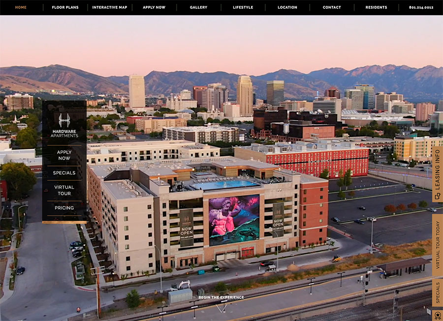
What it does well:
- Unique design
- Captivating hero video on the homepage
- Smooth navigation and CSS effects
Areas of improvement:
- Overwhelming, not sure what is the main call to action
- Not as easy to navigate
- Pop-up can interfere
- Could be a bit busy and not very accessible
4. Flats Fort Collins – built by Brindle
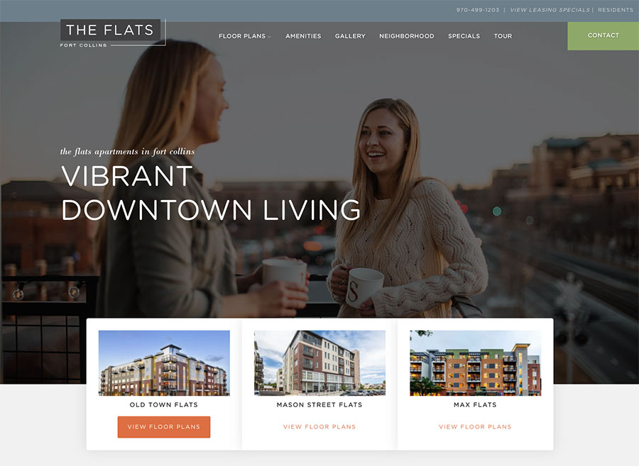
What it does well:
- Clean, modern design
- Easy to navigate and find availability for three different buildings
- Clear call-to-action and great lifestyle photos
- Inviting!
Areas of improvement:
- Would be great to see a virtual tour for each different floor plan layout
- Include an interactive neighborhood map
5. Pine 25 North End
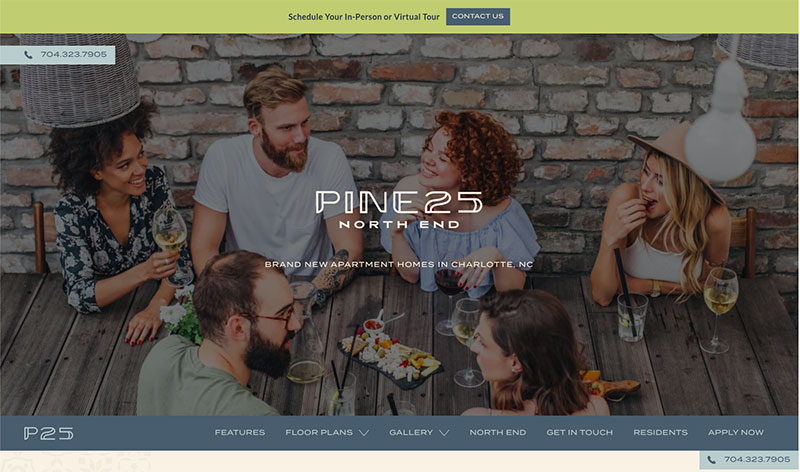
What it does well:
- Unique navigation below the hero (but still easy to find and navigate)
- Clear calls to action
- Cool neighborhood page
Areas of improvement:
- Live pricing and availability don’t appear on the floor plans page (have to navigate off-site)
- Less stock photos
- More gallery photos
- Limit the top navigation menu
6. Six Canyon – built by Brindle
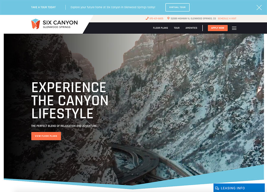
What it does well:
- Capturing hero video
- Easy to find pricing and availability
- Great virtual tours
- Simple and modern
Areas of improvement:
- More gallery photos of the interiors (staged, preferably)
7. 202 Park – built by Brindle
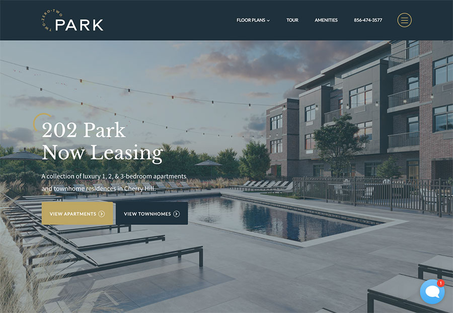
What it does well:
- Simple sophistication
- Easy to find pricing and availability
- Clean design with gorgeous photos
Areas of improvement:
- Only one apartment virtual tour and it’s of a rendering
If you’re in the process of redesigning your apartment website, there are an overwhelming number of options out there. Many multifamily pros choose to hire a digital agency to design their website to get the competitive edge they need.
At Brindle, we specialize in Loveland web design while offering our services nationwide. Whether you’re a multifamily developer, property manager, or professional, we’re here to help you create websites that not only work seamlessly but also stand out and attract the leads you need. Check out our portfolio for some fresh apartment website ideas!
And when it comes to making your website dreams a reality, we’ve got options to suit every need. Whether you’re after a custom website design or a budget-friendly apartment website template, Brindle and our partner Bluprint have got you covered. No matter your timeline or budget, let’s work together to create something special.
