
In this post we’re breaking down 7 of our favorite modern website color schemes for 2022 – 2023 (although if you ask us, some of these are timeless).
So whether you’re simply looking for inspiration or where to get started on choosing a color scheme for your website, tune in.
We’re strong believers that having a strong website color palette can not only keep visitors on your site longer (because who doesn’t like to scroll through a beautiful site) but also convert at a higher rate.
Note: our designers hand-curated each one of these color palettes (no auto-generation happening here) – hope you enjoy!
Let’s dive right in, shall we?
Table of Contents
- 7 Website Color Schemes for 2022
- 4 Ways to Choosing Website Colors for UX/UI Design
- How many colors to use in a website design
- Choosing photos that complement your website color scheme
- Creating a website style guide
- Color Psychology
- Favorite Tools for Website Color Schemes & Palettes
7 Website Color Schemes for 2022
From what’s trending right now in the design and fashion world to timeless modern website color palettes, we’re confident you’ll fall in love with at least one of these palettes below.
Bookmark, pin, share, and let us know your favorite color scheme from this post.
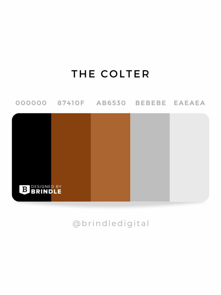
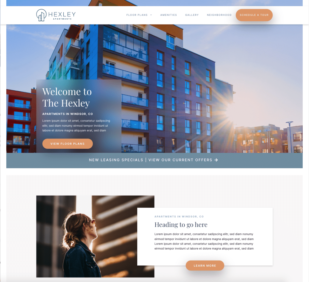
1 – Timeless Luxury – The Colter website color scheme
This website color palette comes from one of our multifamily website themes, The Colter. Rich rust and saddle-browns paired with neutrals make this a timeless, simple, and elegant palette.
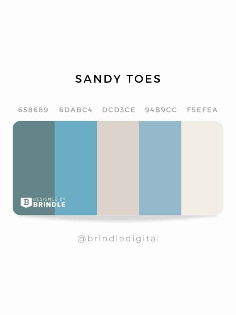
2 – Natural, Young, & Fresh – Sandy Toes website color scheme
Vibes we get from these colors: natural, calming… zen. Inspired by the colors you’d see as taking a stroll along the beach.
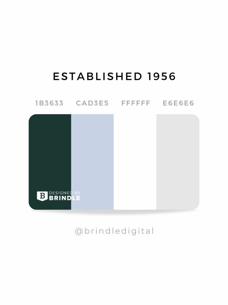
3 – Bold, Confident, & Rooted – Established 1956 color scheme
This was a color palette we curated for a property management company rebrand that wanted to be perceived as trustworthy, professional, responsible, competent, and approachable.
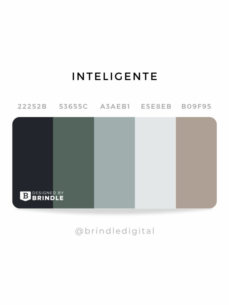
4 – Masculinity, Dark, Moody – Inteligente color scheme
Sophisticated and intelligent. Meet the ‘inteligente’ website palette. *Chef’s kiss*
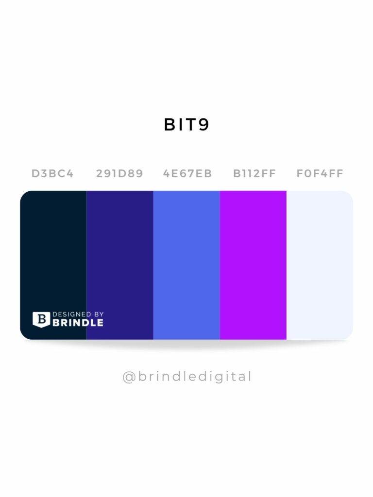
5 – Bright Purple Hues – Bit9 website color scheme
Inspired by the Pantone color of the year – Very Peri – Bit9 IT Solution’s palette delivers an unexpectedly bold and vibrant color palette that is strong, technology-forward, and approachable all at the same time.
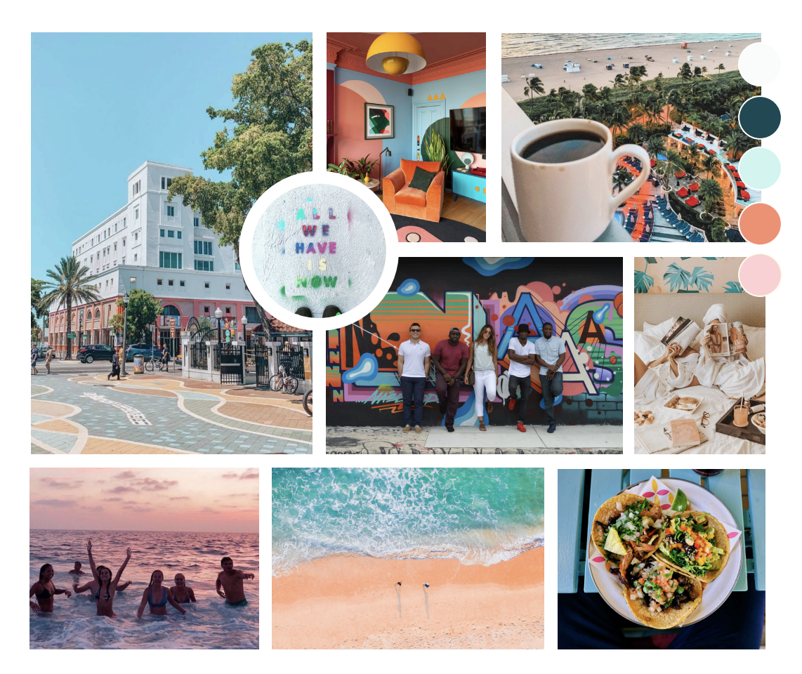
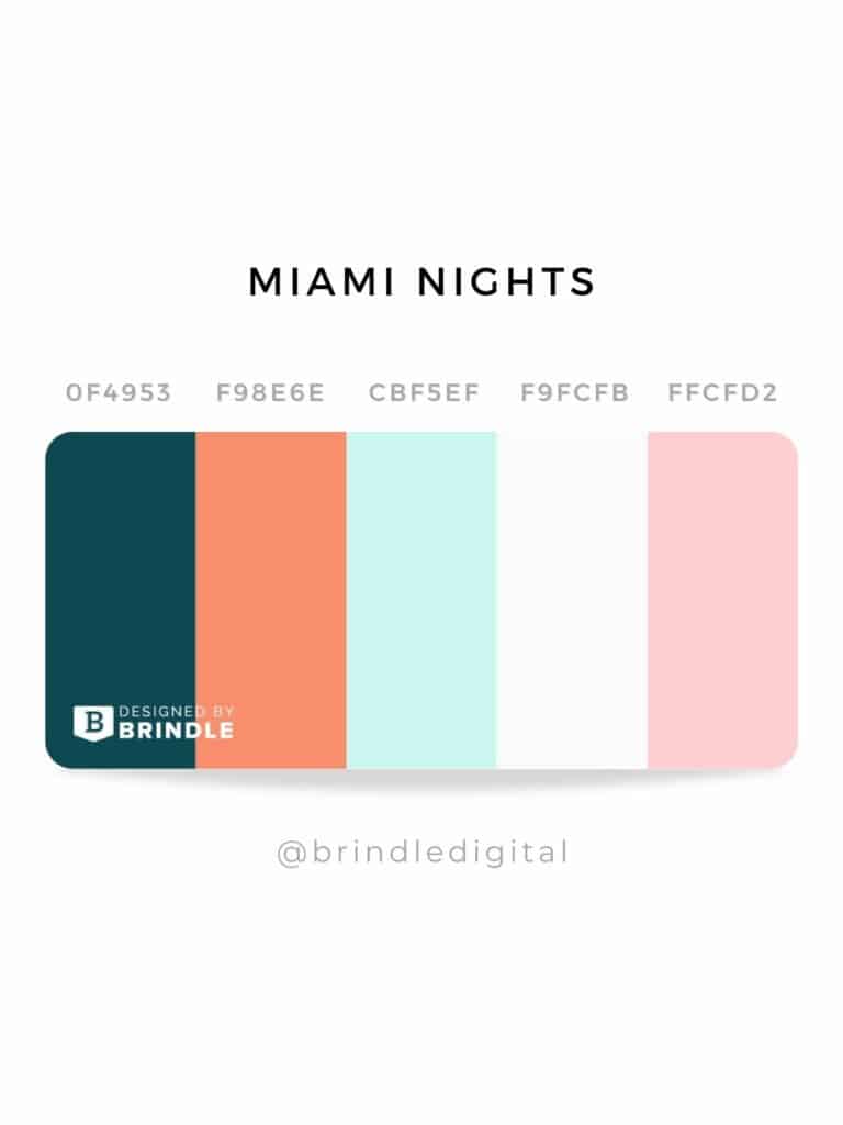
6 – Bright and Energetic – Miami Nights Color Scheme
Miami Vice inspired hues with energy and bright colors, this website color scheme is fun, playful, and energetic similar to many of the colors found in the Little Havana neighborhood.
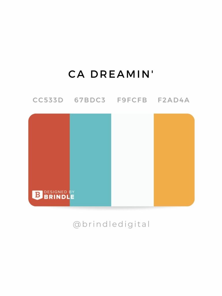
7 – primary with pizazz – California Dreamin’ Color Scheme
Primary colors, but with a splash of personality that we can’t get enough of.
4 Ways to Choosing Website Colors for UX/UI Design
Selecting colors when designing a website can be a daunting task as a DIYer and as a web designer, there are a few ways to tackle selecting those colors – and then knowing how and when to use them on your website.
One: Brand Guidelines
The obvious, use your brand guidelines or brand style guide as a resource to follow the vision for the brand’s color usage.
We realize a brand guide isn’t something all companies may have, so we’ll cover a couple of additional ways we’ve used to help clients choose a color scheme for their website, inspired by
Two: select colors used in your logo
Use a color picker tool to select 2-3 colors in your logo. If you don’t have colors, you can expand your color scheme by selecting a couple of additional colors that complement the colors used in your logo. We’ve outlined a handful of website color palette resources at the end of this article.
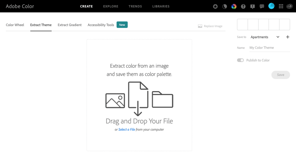
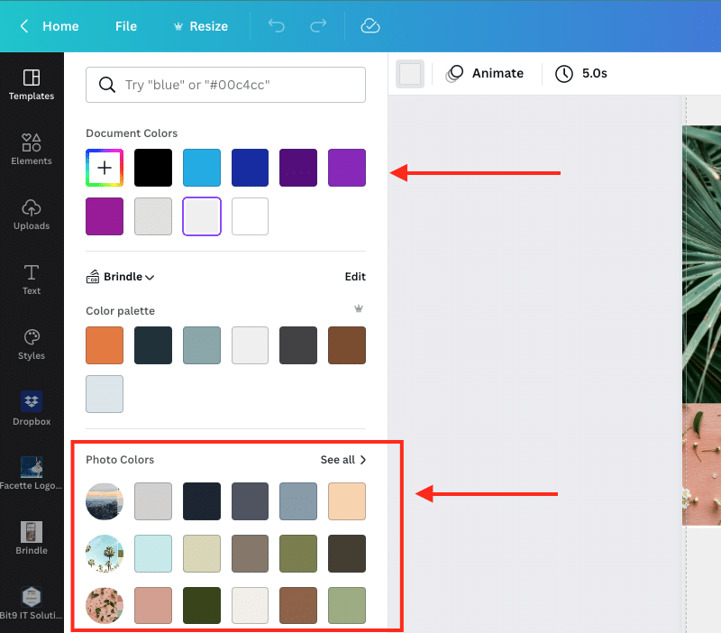
Three: Extract colors from brand photography
Maybe you already have brand photography, but are empty-handed when it comes to any type of formal brand guide. Using a couple of helpful tools, you can extract the colors used in your photos to craft a color scheme.
We’ve outlined a couple of ways to do that below:
Adobe Color Wheel
Canva
Upload a couple of your best photos that represent your brand to a blank design and navigate to the color icon in the top left. You will be able to see colors used in that design or in the photos.
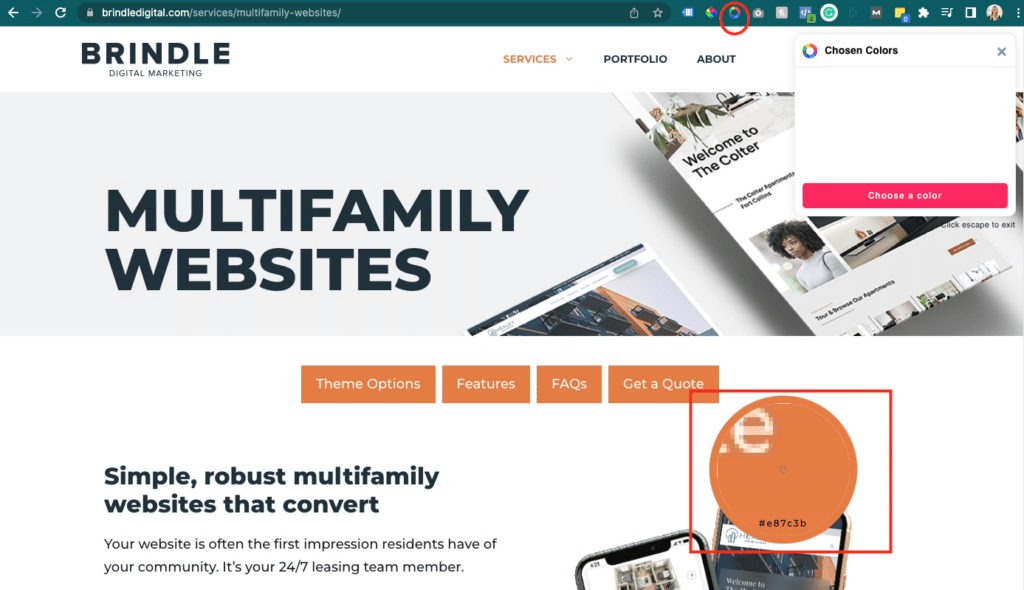
Color Picker Tools
There are endless tools out there to use an ‘eyedropper’ tool and extract colors from a website, photo, etc.
Chrome Extensions:
- Colorpick Eyedropper
- Color by Fardos
- Photoshop is another option if you have the software.
Four: hand-picking colors from scratch
When all you’ve got is a logo and a blank slate, you can have fun selecting a scheme with 3-5 colors to use on your website. There are some awesome palette tools on the web to help you select colors that complement and look good with each other.
Resources:
FAQs
How many colors should I use in a website design?
Simple answer: a good rule of thumb is 3-5 colors.
- 1-2 dominant colors that relate to your brand
- 1-2 secondary colors
- 1 accent or contrast color for buttons/CTAs, etc.
We follow the 60/30/10 rule of thumb that Rachel also outlined in her video above. 60% (ish) should be the dominant color(s), 30% the secondary color(s) and 10% the accent or contrast color.
As with most things in life, use it as a guideline, not a strict rule.
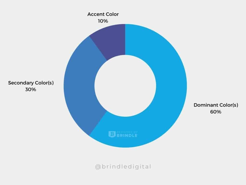
If you’re using too many colors on your website, everything becomes a priority and users don’t know what to do/where to look.
Choosing photos that complement your website color scheme
It doesn’t just stop at choosing a website color scheme, selecting photos that fit within your website colors makes the overall design feel more cohesive. Our designers at Brindle spend a lot of time curating photos that align with your brand when designing custom websites for clients.
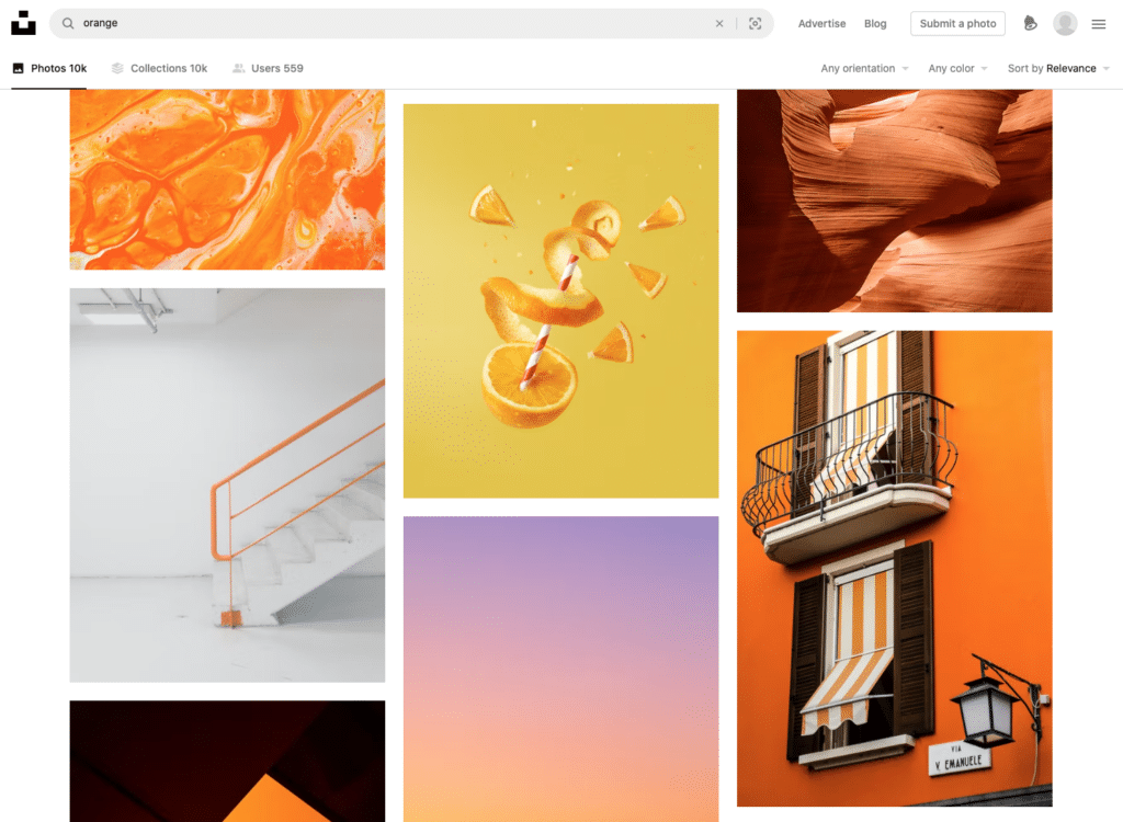
Let’s say orange is your accent color, having photos that also have a splash of orange in them will make your website look well put together and intentionally designed.
Tips:
1 – If you’re taking your own brand photos, incorporate splashes of your brand or logo colors in your photos with props, accessories, branded collateral, etc.

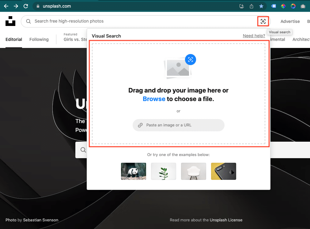
2 – Unsplash Visual Search
In the search bar of Unsplash.com, upload your own photos or an inspiration photo to find others with similarities.
3 – On stock photo sites, you can also search many stock photo sites by the color alone. Give it a go!
Creating a website style guide
Colors are chosen but now you have to decide where and how to use these colors.
What colors will the buttons be?
Background(s)?
Footer color?
And so forth.
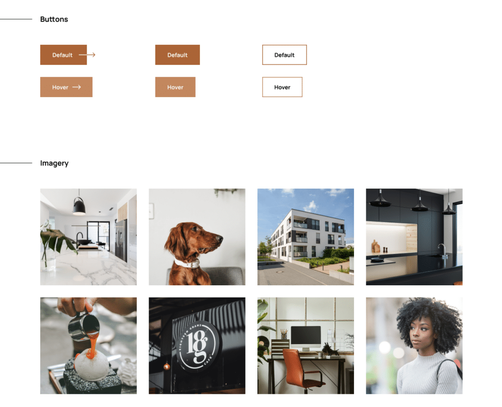
At Brindle, our web designers outline the design styles used in the website, which is helpful for the developer and as a resource to look back on or to use as a guideline when expanding the photography used to ensure it aligns with the overall scheme.
Best practice guidelines:
- Ensure your buttons are consistent; limit your web design to 1-2 button styles for most websites
- Make sure that the colors you select for buttons, background sections, and so forth have enough contrast to meet ADA web guidelines (something we follow when designing websites for multifamily clients and suggest for clients).
Color Psychology on Websites
You only have a few seconds to make an impact when a visitor lands on your site and while there are many factors to consider such as copywriting and design, color plays a huge role in the first impression people will have of your company.
As web designers, it’s our job to ensure your website is visually appealing and strikes the right message to the right audience.
As Nick mentions in his Color Psychology article, people assume that each color has a meaning:
- Blue means ____________.
- Brown means ____________.
- Orange means____________.
But, as mentioned, it’s not that straightforward. The meaning depends on past experience.
Do yourself a favor and spend 10 minutes reading this article on color psychology or watching his YouTube video on color theory, meanings, and marketing.
Color Psychology in Marketing Resource
At Brindle, we serve the multifamily and real estate industry through logo and branding, website design and development, and digital marketing services. With over 15 years of experience and hundreds of sites launched we’d love to chat and see if we’re a good fit for your next project.